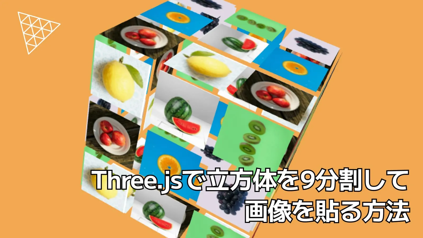
はじめに
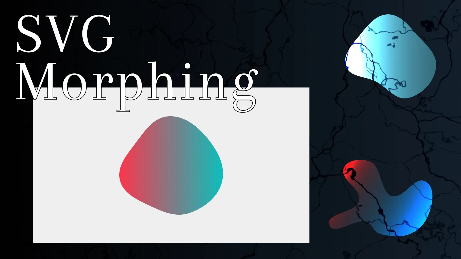
今回はSVGモーフィングと連動した画像の切り替えアニメーションの解説をします。
アニメーションの制御にはGSAPを使います🍀
👇は完成形のCodePenデモです!
結論としては、画像の切り抜きにはSVG内で指定してあるclipPathでしてあり、GSAPを使ってpathの変更や画像の切り替えを行っています。
それでは見ていきましょう!
HTMLとCSS
まずは基本的なHTMLとCSSを見ていきましょう!
HTML
<div class="morph-img">
<svg class="img-svg" width="500" height="500" viewBox="0 0 500 500">
<defs>
<clipPath id="clipShape">
<path class="svg-path"
d="M 378.1,121.2 C 408.4,150 417.2,197.9 411,245.8 404.8,
293.7 383.5,341.7 353.4,370.7 303.2,419.1 198.7,427.7 144.5,
383.8 86.18,336.5 67.13,221.3 111.9,161 138.6,125 188.9,
99.62 240.7,90.92 292.4,82.24 345.6,90.32 378.1,121.2 Z"
/>
</clipPath>
</defs>
<g clip-path="url(#clipShape)">
<image class="img" href="https://picsum.photos/500/500?random=1" />
<image class="img" href="https://picsum.photos/500/500?random=2" />
<image class="img" href="https://picsum.photos/500/500?random=3" />
<image class="img" href="https://picsum.photos/500/500?random=4" />
</g>
</svg>
</div>画像をSVGで切り抜くには<clipPath>要素の中にpathで形状を指定します。SVGモーフィングに連動して画像を切替えるようにするので<g>要素で画像をグループ化させます。このグループでclip-path="url(#clipShape)"と<clipPath>でのidを指定してあげることで画像をSVGで切り抜くことができます✂️
画像の形状を決めるのは、<path>要素になります。ここでは初回表示の時の形状を書きます。あとでJavaScriptで形状を変化させるのでclassにsvg-pathを指定しておきましょう。
それではCSSを見ていきましょう!
CSS
今回のレイアウトに関係がありそうな箇所は以下のコードになります
.img {
opacity: 0;
transition: opacity 1.5s ease-in;
}ここでは画像を切替えるので初回時は全ての画像を消しておきましょう!
また、画像切替のtransitionはCSSで設定しておきます。
最後にJavaScriptになります!
JavaScript
👇は今回のJavaScriptの全コードになります。
class SVGMorphing {
constructor() {
this.el = document.querySelector('.morph-img');
if(!this.el) return
this.init();
}
init() {
const paths = [
'M 378.1,121.2 C 408.4,150 417.2,197.9 411,245.8 404.8,293.7 383.5,341.7 353.4,370.7 303.2,419.1 198.7,427.7 144.5,383.8 86.18,336.5 67.13,221.3 111.9,161 138.6,125 188.9,99.62 240.7,90.92 292.4,82.24 345.6,90.32 378.1,121.2 Z',
'M 418.1,159.8 C 460.9,222.9 497,321.5 452.4,383.4 417.2,432.4 371.2,405.6 271.3,420.3 137.2,440 90.45,500.6 42.16,442.8 -9.572000000000003,381 86.33,289.1 117.7,215.5 144.3,153.4 145.7,54.21 212.7,36.25 290.3,15.36 373.9,94.6 418.1,159.8 Z',
'M 451.5,185.8 C 441.5,266.2 339.6,305 272.3,350.2 207.7,393.6 226.7,444.7 182.6,447.9 132.8,451.4 83.97,399.9 66.37,353.1 34.6,268.4 41.16,141.8 112,85.44 186.1,26.33 313.8,54.1 396,101.4 425.2,118.2 455.6,152.4 451.5,185.8 Z',
'M 368.1,46.41999999999999 C 461,96.69 473.7,266.2 422.3,358.4 379.1,436 259.6,484.8 175,457.5 107.5,435.7 12.650000000000006,329.8 60.93,277.7 95.18,240.8 154,379.3 194.2,348.9 250.7,306 116,204.1 148.4,140.9 184.8,70.02 298,8.455000000000013 368.1,46.41999999999999 Z',
];
this.svgPath = this.el.querySelector('.svg-path');
this.images = this.el.querySelectorAll('.img');
this.animation(paths);
}
animation(paths) {
const tl = gsap.timeline({
repeat: -1,
defaults: { duration: 2.8, ease: "elastic.inOut",},
});
paths.forEach((path, index) => {
const nextIndex = (index + 1) % paths.length;
tl.to(this.svgPath, {
attr: { d: paths[nextIndex] },
onStart: () => {
this.images[nextIndex].style.opacity = 1;
},
onComplete: () => {
this.images[nextIndex].style.opacity = 0;
}
});
});
}
}
new SVGMorphing();今回は画像4枚で切り替えアニメーションを行うのでSVGのpathの形状を4つ用意し変数で定義しておきます。
const paths = [
// 1回目
'M 378.1,121.2 C 408.4,150 417.2,197.9 411,245.8 404.8,293.7 383.5,341.7 353.4,
370.7 303.2,419.1 198.7,427.7 144.5,383.8 86.18,336.5 67.13,
221.3 111.9,161 138.6,125 188.9,99.62 240.7,90.92 292.4,
82.24 345.6,90.32 378.1,121.2 Z',
// 2回目
'M 418.1,159.8 C 460.9,222.9 497,321.5 452.4,383.4 417.2,
432.4 371.2,405.6 271.3,420.3 137.2,440 90.45,500.6 42.16,
442.8 -9.572000000000003,381 86.33,289.1 117.7,215.5 144.3,153.4 145.7,
54.21 212.7,36.25 290.3,15.36 373.9,94.6 418.1,159.8 Z',
// 3回目
'M 451.5,185.8 C 441.5,266.2 339.6,305 272.3,350.2 207.7,
393.6 226.7,444.7 182.6,447.9 132.8,451.4 83.97,399.9 66.37,
353.1 34.6,268.4 41.16,141.8 112,85.44 186.1,26.33 313.8,
54.1 396,101.4 425.2,118.2 455.6,152.4 451.5,185.8 Z',
// 4回目
'M 368.1,46.41999999999999 C 461,96.69 473.7,266.2 422.3,358.4 379.1,
436 259.6,484.8 175,457.5 107.5,435.7 12.650000000000006,329.8 60.93,
277.7 95.18,240.8 154,379.3 194.2,348.9 250.7,306 116,
204.1 148.4,140.9 184.8,70.02 298,8.455000000000013 368.1,46.41999999999999 Z',
];Important
ここでSVGモーフィングをスムーズにさせるためには、アンカーポイントの数を揃える必要があります。
今回の場合は19個になっていますね!
SVGのpathを自分で作るのは大変なので、デモのSVGのpathは👇️のCodropsの記事からお借りしました。
最後にGSAPでアニメーションさせるコードを見てみましょう!
animation()
animation(paths) {
const tl = gsap.timeline({
repeat: -1,
defaults: { duration: 2.8, ease: "elastic.inOut",},
});
paths.forEach((path, index) => {
const nextIndex = (index + 1) % paths.length;
tl.to(this.svgPath, {
attr: { d: paths[nextIndex] },
onStart: () => {
this.images[nextIndex].style.opacity = 1;
},
onComplete: () => {
this.images[nextIndex].style.opacity = 0;
}
});
});
}SVGモーフィングをループさせるためにGSAPのtimelineを使います。repeat: -1とすることでループさせることができます!同時にdurationとeasingも設定しておきます。跳ねるようなアニメーションにしたかったのでeasingにはelasticを使ってます。
SVGのパスの変化と画像の切り替えの部分はぱっと見は分かりづらいと思うので、愚直にやった例を見てみましょう!
tl.to(this.svgPath, {
attr: { d: paths[0] },
onStart: () => {
this.images[0].style.opacity = 1;
},
onComplete: () => {
this.images[0].style.opacity = 0;
}
}).to(this.svgPath, {
attr: {d : paths[1] },
onStart: () => {
this.images[1].style.opacity = 1;
},
onComplete: () => {
this.images[1].style.opacity = 0;
}
})
// 以下続く愚直にtimelineで繋げて書くと↑のような感じになるかと思います。
アニメーション始まりで画像を表示させてパスを変化させる。完了したら非表示って感じですね!
これだと画像枚数分のコードを書かなくてはいけなくなるので、pathsで配列化しているのでforEachでいい感じに書きます。
paths.forEach((path, index) => {
const nextIndex = (index + 1) % paths.length;
tl.to(this.svgPath, {
attr: { d: paths[nextIndex] },
onStart: () => {
this.images[nextIndex].style.opacity = 1;
},
onComplete: () => {
this.images[nextIndex].style.opacity = 0;
}
});
});ここでnextIndexで次のパスのインデックスを計算している理由は、最後のパスのアニメーションが終わって最初のアニメーションに戻るときに形状がスムーズに切り替わらないからです。(説明が難しいのでnextIndexではなくindexを渡して試してみてください!)
このおかげでスムーズなループを実現できます!
ただ、この実装だとアニメーション開始時に1枚目の画像のopacityが0のままなので表示されない問題点があります、、、
別のいい案がありましたら教えていただきたいです!
まとめ
GSAPを利用したSVGモーフィングと連動した画像の切り替えアニメーションの作り方を解説しました。
最後のアニメーションのコードの箇所が分かりづらいかとは思いますが、ぜひ愚直にtimelineで繋げた場合などを試してみてどうなっているのか確認してみてください!
この記事が参考になれば幸いです。